
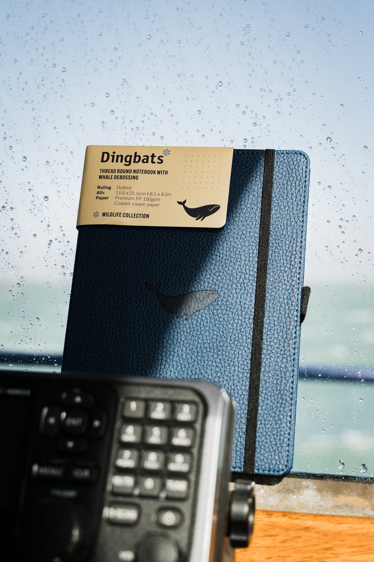
There is something satisfying about opening a notebook filled with beautiful pages.
Neat headings, carefully chosen colors, balanced layouts, handwritten notes, and small creative details can make even an ordinary page feel special. But there is a difference between a notebook that looks beautiful and one that is actually useful.
You might spend twenty minutes designing a page that takes only five minutes to fill. You might avoid adding an important note because it would ruin the layout. Or you might create an elaborate system that looks impressive but becomes difficult to maintain.
The best aesthetic notebooks find a balance. They look good, but they also work.
Here is how to create an aesthetic notebook that feels personal, organized, and enjoyable to use.
What Makes a Notebook Aesthetic?
An aesthetic notebook has a consistent visual character. That might mean simple black ink and generous white space, warm neutral colors, carefully arranged headings, nature-inspired illustrations, or expressive pages filled with sketches and scraps.
There is no single aesthetic that every notebook needs to follow. Some people prefer minimalism. Others enjoy colorful pages, handwritten lettering, collage, or artistic layouts.
What makes a notebook visually appealing is usually the relationship between its elements: color, spacing, structure, typography, and personal details.
Popular Notebook Aesthetic Styles
| Style | Key Characteristics |
|---|---|
| Minimalist | Simple headings, limited colors, plenty of space |
| Neutral | Beige, brown, cream, muted earth tones |
| Nature-inspired | Botanical sketches, wildlife motifs, natural colors |
| Vintage | Handwritten titles, paper scraps, stamps, classic lettering |
| Colorful | Bright accents, playful headings, creative layouts |
| Academic | Structured notes, annotations, tabs, highlighted references |
| Artistic | Sketches, moodboards, illustrations, experimental pages |
The important thing is choosing a style that feels natural to you rather than trying to recreate someone else's notebook.
1. Start With a Simple Color Palette
One of the easiest ways to make notebook pages look more cohesive is to limit your color palette. Using too many unrelated colors can make a page feel visually crowded. A smaller selection creates consistency without requiring complicated designs.
Try choosing one main writing color and two accent colors. For example, you might write in black ink, use muted green for headings, and warm brown for important notes.
Notebook Color Palette Ideas
| Palette | Colors | Overall Feel |
|---|---|---|
| Earthy neutrals | Brown, olive, cream | Warm and grounded |
| Soft minimalism | Black, gray, beige | Clean and understated |
| Coastal | Navy, pale blue, sand | Calm and relaxed |
| Botanical | Forest green, sage, brown | Nature-inspired |
| Warm vintage | Burgundy, terracotta, cream | Classic and expressive |
| Modern creative | Black, cobalt blue, yellow | Bold and energetic |
You do not need to match every page perfectly. Using familiar colors for repeated elements is enough to create a recognizable style. A consistent palette can also make your notes easier to read by giving different kinds of information their own visual identity.

2. Choose a Notebook That Already Matches Your Style
A notebook with cream-colored paper can create a warmer visual atmosphere, while dotted pages make it easier to design flexible layouts. A tactile or illustrated cover can also give the notebook personality before the first page is filled.
Choose a notebook that complements the kind of pages you actually want to make.

3. Use Headings to Create Visual Hierarchy
Aesthetic notebook pages often look organized because they use clear visual hierarchy. This means making it easy to distinguish titles, sections, and ordinary notes. You can achieve this without elaborate calligraphy or decorative lettering.
Try using three levels:
Main title: Slightly larger handwriting or capital letters.
Section heading: Underlined or written in an accent color.
Body text: Your normal handwriting.
Simple Heading Styles
| Heading Style | Best For |
|---|---|
| ALL CAPS | Main titles and clear sections |
| Underlined | Everyday notes and planning |
| Small banner | Journaling and creative pages |
| Highlighted text | Important headings |
| Numbered titles | Step-by-step layouts |
| Hand-lettered headings | Creative journals and sketchbooks |
Consistency makes the page feel intentional. You do not need a new heading design every time you turn the page.
4. Leave Room for White Space
A visually appealing notebook does not need every inch of the page filled. Empty space helps separate ideas, gives layouts balance, and makes information easier to scan.
You can use white space between headings, around lists, beside drawings, or underneath important notes.
This also leaves room for later additions. For example, if you are taking meeting notes, leave a small margin for follow-up questions or decisions.
If you are journaling, leave space between different thoughts or moments.
If you are creating a moodboard, allow individual images and words enough room to stand out.
White space is not wasted space.
It is part of the layout.
5. Keep Your Layouts Repeatable
One of the biggest challenges with aesthetic notebooks is maintaining them.
A complicated layout may look beautiful once, but become frustrating if you have to recreate it every day.
Instead, choose a few simple layouts that you can use repeatedly.
Easy Aesthetic Notebook Layouts
| Layout | Best For |
|---|---|
| Date + heading + notes | Everyday writing |
| Two-column page | Notes and questions |
| Boxed sections | Planning and project updates |
| Simple weekly grid | Tasks and priorities |
| List with a colored heading | Reading lists, ideas, reminders |
| Sketch + caption | Creative research and travel |
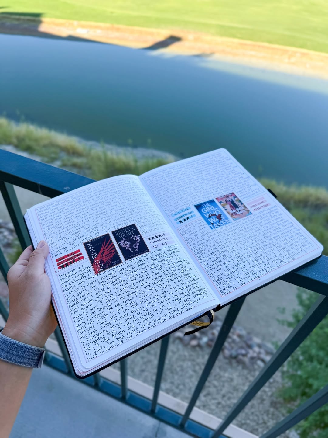
| Quote + reflection | Journaling and reading notes |
A repeated layout can become part of your notebook's identity. The pages will feel connected even when the content changes.
6. Add Small Illustrations Instead of Complicated Artwork
You do not need to be an artist to make a notebook feel creative. Small illustrations can add personality without taking over the page.
Try drawing a leaf beside a nature observation, a tiny coffee cup next to a cafe memory, or a simple book icon beside a reading note. Other easy details include stars, flowers, moons, clouds, geometric shapes, arrows, and miniature borders. These elements should complement the content rather than compete with it.
For example, if you are creating a travel page, a small sketch of a window, building, landscape, or ticket can make the entry more memorable.

7. Use Simple Symbols for Organization
Symbols can make your notebook both more aesthetic and more functional. A small set of consistent marks helps the eye recognize tasks, ideas, questions, and important information.
A Simple Notebook Symbol Key
| Symbol | Meaning |
|---|---|
| □ | Task |
| ✓ | Completed |
| ★ | Important |
| → | Next action |
| ? | Question |
| ! | Insight |
| ○ | Event |
| ✦ | Creative idea |
You can write these symbols in your regular ink color or use an accent color for emphasis.
Avoid creating so many symbols that you need to consult a reference page constantly. The system should make your notebook easier to use.
8. Experiment With Different Handwriting Styles
Your handwriting does not need to be perfect to create attractive pages. In fact, variations in handwriting can add character.
You might use print lettering for headings, smaller handwriting for notes, and a looser style for personal reflections. Try changing letter size or spacing instead of attempting complicated lettering techniques.
For example, a title written slowly in spaced capital letters can look distinctive without requiring artistic skill.
The goal is to create contrast between different parts of the page. And remember that ordinary handwriting belongs in an aesthetic notebook, too.
A notebook should still feel like yours.
9. Use Tabs, Bookmarks, and Pockets Thoughtfully
Notebook accessories and built-in features can support both organization and appearance.
You might use these features to organize:
- Current planning pages
- Reading notes
- Project sections
- Favorite quotes
- Travel memories
- Loose references
The goal is not to add as many accessories as possible. Choose the ones that make the notebook easier to navigate. A few useful details often create a cleaner experience than excessive decoration.

10. Make Lists Look Intentional
Lists are among the most common notebook layouts, but they do not have to look plain. A simple heading, consistent indentation, and balanced spacing can make an everyday list visually appealing.
For example, instead of writing one long collection of tasks, divide them into categories.
Example: Weekly Priorities
| Work | Personal |
|---|---|
| Finish presentation | Book appointment |
| Review project notes | Plan weekend |
| Send follow-up emails | Finish current book |
You can also use numbered lists for sequences, checkboxes for tasks, and small circles for ideas. The best list format depends on what you need to do with the information. Aesthetic organization should improve clarity.
11. Create a Signature Page Style
A signature style is a small combination of design choices that appears throughout your notebook. It might include a particular heading format, color palette, margin width, date placement, or recurring illustration.
For example:
Your notebook style could be:
- Dates in the upper-right corner
- Main headings in uppercase
- Black ink for writing
- Sage green for important details
- Small line drawings in the margins
You do not need to use every element on every page. The repetition creates a sense of consistency. Over time, the notebook begins to feel unmistakably yours.
12. Let Different Pages Have Different Personalities
Consistency is useful, but too much rigidity can make a notebook feel restrictive. Not every page needs to look identical. A planning page might be clean and structured. A travel page might contain sketches and tickets. A journal entry might be full of writing. A creative page might be colorful and experimental.
The notebook can still feel cohesive through its paper, handwriting, and general color palette.
This is particularly important if you use one notebook for several purposes. Allow the design to respond to the content. Some ideas need order. Others need freedom.
Minimalist Notebook Layout Ideas
Minimalist notebooks focus on clarity, restraint, and useful space.
They work especially well for professionals, writers, and anyone who prefers a clean visual style.
Minimalist Layout Examples
| Layout | Design Approach |
|---|---|
| Daily notes | Date, one heading, simple text |
| Weekly priorities | Three sections with checkboxes |
| Meeting notes | Clear headings and action items |
| Reading notes | Book title, quote, personal reflection |
| Project planning | Simple table with tasks and deadlines |
A minimalist aesthetic often relies on well-balanced spacing rather than decorative elements.
Black ink, a single accent color, and clear headings can be enough.
Nature-Inspired Notebook Layout Ideas
Nature-inspired layouts use organic colors, simple illustrations, and references to the natural world.
Consider muted greens, browns, soft blues, and warm neutrals.
Nature-Inspired Page Ideas
| Page | Creative Detail |
|---|---|
| Daily journal | Small leaf illustration |
| Travel memory | Landscape sketch |
| Reading notes | Botanical border |
| Weekly planner | Earth-toned headings |
| Observation page | Animal or plant sketch |
| Moodboard | Natural colors and textures |
The effect can be subtle.
A single illustration or carefully chosen color may be more effective than covering the entire page with decoration.

Creative and Artistic Notebook Layout Ideas
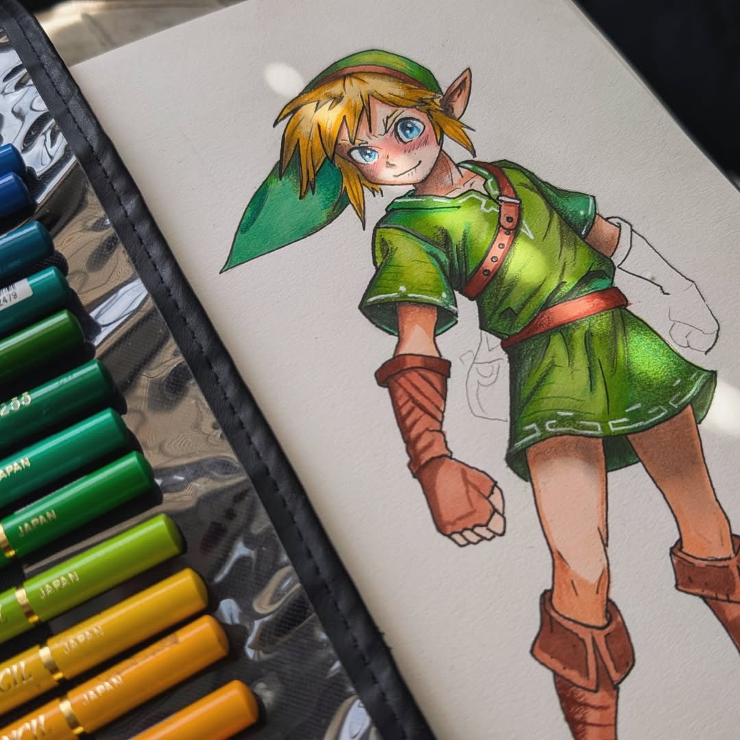
For people who enjoy drawing, design, and visual thinking, notebook pages can become more expressive. You might combine written notes with sketches, diagrams, color swatches, lettering experiments, or collage.
Creative Layout Examples
| Layout | What to Include |
|---|---|
| Moodboard | Colors, textures, sketches, words |
| Creative research | References, notes, visual studies |
| Design exploration | Several concept sketches |
| Color study | Swatches and combinations |
| Process page | Experiments, annotations, revisions |
| Visual journal | Drawings combined with reflection |
Creative pages do not need to be perfectly composed. Sometimes the most interesting layouts come from experimentation.

How to Make Your Notes Look Aesthetic for Work
Aesthetic note-taking is not limited to journals and creative notebooks. Professional notes can also benefit from visual organization. A consistent format makes meetings, projects, and ideas easier to revisit. Try using clear section headings such as:
Discussion
Decisions
Questions
Next Steps
Keep your body text simple, and reserve one accent color for important information.
Example Work Notes Layout
| Section | Notes |
|---|---|
| Meeting title | |
| Date | |
| Key discussion | |
| Decisions | |
| Action items | |
| Follow-up questions |
A well-designed work page should look clear at a glance. That matters more than decoration.

Common Aesthetic Notebook Mistakes
Making Every Page Too Complicated
If every entry requires elaborate headings, illustrations, and multiple colors, the process can become difficult to maintain. Keep detailed designs for pages you genuinely enjoy creating, and use simpler layouts for everyday entries.
Choosing Appearance Over Readability
An attractive page should still be easy to understand. Avoid using colors that are too faint, headings that blend into the body text, or decorations that obscure important information.
Trying to Copy Every Trend
Being Afraid to Make Mistakes
Crossed-out words, uneven lettering, and changed plans are part of using a notebook. An aesthetic notebook should not become too precious to write in.
Buying Too Many Accessories
You do not need a collection of pens, tapes, stickers, and markers to make beautiful pages. A notebook, one good pen, and a small selection of colors can be enough.
Which Dingbats* Notebook Is Best for Aesthetic Pages?
The best choice depends on your preferred style and how you intend to use the notebook.
- Wildlife Collection: Personal, nature-inspired, everyday, minimalist
- Earth Collection: Structured, organized, dotted layouts, planners
- Pro Collection: Artistic, expressive, mixed media, creative layouts

Frequently Asked Questions
How can I make my notebook look aesthetic?
Start with a simple color palette, consistent headings, balanced spacing, and a few personal details. You do not need complicated artwork or expensive accessories.
What do I need for an aesthetic notebook?
A notebook and pen are enough to begin. You can add a highlighter, colored pen, ruler, or occasional stickers if they suit your style.
How can I make my notes look pretty but still readable?
Use clear headings, consistent spacing, limited accent colors, and simple visual organization. Keep decorative elements separate from the main information.
What is a minimalist notebook aesthetic?
A minimalist notebook aesthetic emphasizes clean layouts, limited colors, simple headings, and generous white space. It prioritizes clarity over decoration.
Are dotted notebooks good for aesthetic layouts?
Yes. Dotted notebooks are useful for creating tables, trackers, boxes, grids, and flexible layouts while maintaining a clean appearance.
Can I make an aesthetic notebook without good handwriting?
Absolutely. Clear spacing, simple headings, and consistent layouts can make pages attractive regardless of handwriting style.
Which Dingbats* notebook is best for aesthetic journaling?
The Wildlife Collection works well for personal and nature-inspired journaling, the Earth Collection is ideal for structured layouts, and the Pro Collection is particularly suited to expressive artistic pages.

Leave a comment
All comments are moderated before being published.
This site is protected by hCaptcha and the hCaptcha Privacy Policy and Terms of Service apply.