
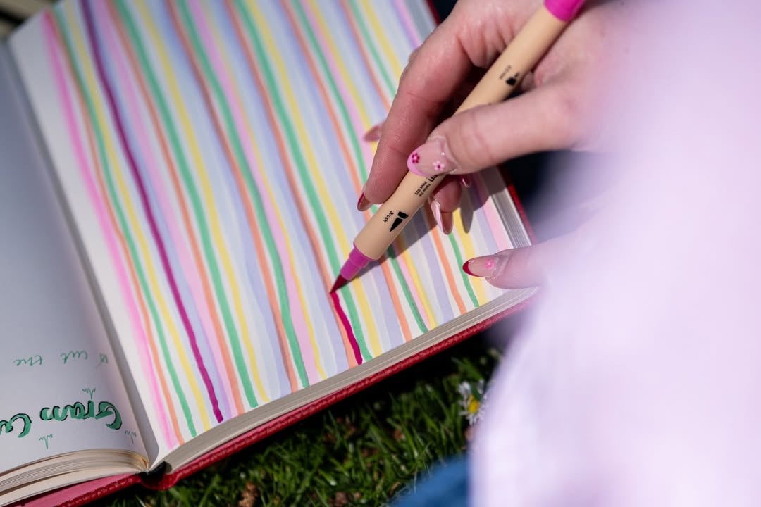
Beautiful lettering can make even the simplest words feel special. A handwritten quote, a carefully drawn heading, a name on a greeting card, or a decorative title in your journal can become a small creative project of its own.
And the best part? You don't need to have naturally beautiful handwriting to learn brush lettering.
Unlike everyday handwriting, brush lettering is about deliberately creating letters through a combination of thick and thin strokes. It's a skill you can develop through repetition, experimentation, and a little patience.
Whether you're looking for a relaxing creative hobby, want to personalize your journal, or simply enjoy working with pens and paper, this beginner's guide will help you get started.
What Is Brush Pen Lettering?
Brush pen lettering is a style of decorative writing created using a pen with a flexible brush-like tip. The tip responds to pressure, allowing you to make thicker strokes when pressing down and thinner strokes when using a lighter touch. This variation in line width gives brush lettering its distinctive appearance.
Unlike traditional calligraphy, which is often associated with dip pens and established scripts, modern brush lettering can be more flexible and expressive. You can experiment with different letter shapes, spacing, sizes, and styles to develop something that feels personal. Check out our Ātopens and find the perfect pen set for your letterings!
Brush Lettering vs Calligraphy vs Handwriting
| Style | Main Characteristic |
|---|---|
| Everyday handwriting | Prioritizes speed and readability |
| Brush lettering | Uses flexible brush tips to create thick and thin strokes |
| Traditional calligraphy | Often follows established letterforms and uses specialized tools |
| Hand lettering | Letters are deliberately drawn or designed, sometimes using several strokes |
Brush lettering is a form of hand lettering, and it can incorporate techniques from calligraphy. For beginners, the goal is not to master every lettering style. It's to understand how pressure and movement create different strokes.

What Do You Need to Start Brush Lettering?
You don't need an elaborate art kit. A brush pen, a notebook with suitable paper, and a little practice time are enough to begin.
Beginner Brush Lettering Supplies
| Supply | Why You Need It |
|---|---|
| Brush pen | Creates thick and thin strokes |
| Smooth paper | Helps the brush tip move comfortably |
| Pencil | Useful for guidelines and planning |
| Ruler | Helps with consistent letter heights |
| Fine liner | Adds outlines, shadows, and details |
| Colored pens | Useful for creative lettering projects |
One of the most important things to consider is paper.
Brush pens can behave differently depending on the surface. Rough paper may create unwanted friction on delicate tips, while overly absorbent paper can affect the appearance of your lines.
Choose paper that feels smooth and works well with your particular pens.
The Dingbats* Pro Collection, with its 160gsm mixed media paper, is a strong option for lettering practice, color experiments, and creative pages.
The Dingbats* Ātopen Dual Tip Pens can also bring more flexibility to your stationery collection, allowing you to explore lettering and everyday writing with different tip styles.

Step 1: Learn the Difference Between Upstrokes and Downstrokes
Brush lettering begins with one simple principle:
Light pressure going up. Heavier pressure going down.
When moving your pen upward, use a gentle touch to create a thin line.
When moving downward, apply more pressure to create a thicker line.
This is the foundation of many brush lettering styles.
Basic Pressure Guide
| Movement | Pressure | Result |
|---|---|---|
| Upstroke | Light | Thin line |
| Downstroke | Firm but controlled | Thick line |
| Connecting stroke | Light | Smooth, thin transition |
| Curved downward movement | Gradually increased | Thicker curved line |
The challenge is learning to change pressure smoothly. Don't worry about writing complete words yet. Focus on creating consistent thick and thin lines.
Step 2: Practice the Basic Brush Lettering Strokes
Before writing the alphabet, practice the movements that appear repeatedly in lowercase letters. These simple shapes help develop control and familiarity with your pen.
Essential Brush Lettering Strokes
| Stroke | How to Practice |
|---|---|
| Upstroke | Draw a thin line upward with light pressure |
| Downstroke | Draw a thick line downward |
| Underturn | Move down thick, curve, then move up thin |
| Overturn | Move up thin, curve, then move down thick |
| Compound curve | Combine an underturn and overturn |
| Oval | Create a rounded shape with changing pressure |
| Ascending loop | Form a tall loop extending above lowercase letters |
| Descending loop | Form a loop extending below the baseline |
These movements appear in letters such as a, b, d, g, h, m, n, and y.
Try filling a few rows with each stroke.
Keep the movements slow and controlled, and avoid pressing harder than your brush pen is designed to tolerate. Consistency matters more than speed.
Step 3: Practice Lowercase Letters
Once the basic strokes begin to feel familiar, move on to individual letters. Start with letters that use similar shapes rather than practicing the alphabet strictly from A to Z.
For example, i, u, w, and t share relatively simple movements.
Letters such as a, d, g, and q rely on oval forms.
Letters including h, b, k, and l introduce taller strokes and loops.
Suggested Letter Practice Groups
| Group | Letters |
|---|---|
| Simple strokes | i, u, t, w |
| Rounded letters | a, d, g, q, o |
| Compound curves | n, m, h |
| Ascenders | b, h, k, l |
| Descenders | g, j, p, y |
| More complex shapes | r, s, x, z |
Practice one group at a time. You don't need to complete the entire alphabet in one session. Instead, focus on making each letter feel comfortable.

Step 4: Use Guidelines for Consistent Lettering
One reason beginner lettering can look uneven is inconsistent letter height. Guidelines help establish where letters begin, end, and extend above or below the main writing area. You can use a pencil and ruler to draw light lines across your practice page.
The four common reference lines are:
- Baseline: Where most letters sit.
- X-height line: The top of regular lowercase letters.
- Ascender line: The upper limit for tall letters such as h and l.
- Descender line: The lower limit for letters such as g and y.
You don't need perfect measurements from the beginning. Simple guidelines can make your practice more consistent. As your confidence grows, you can experiment with taller letters, exaggerated loops, and different proportions.
Step 5: Start Connecting Letters Into Words
Once you've practiced individual letters, begin combining them. Start with short, familiar words.
Hello.
Create.
Bloom.
Dream.
Focus.
Explore.
Wild.
Choose words that contain letterforms you're comfortable with. When joining letters, pay attention to the connecting strokes. Try not to rush from one letter to the next. Allow the brush tip to move lightly between thick downstrokes.
Beginner Word Practice
| Word | What It Helps You Practice |
|---|---|
| Hello | Tall letters and loops |
| Bloom | Rounded shapes and transitions |
| Dream | Curves and letter connections |
| Create | Mixing different letter shapes |
| Wild | Short and tall letter combinations |
| Happy | Ascenders and descenders |
Repeat each word several times. You may notice that the first attempt looks very different from the fifth. That's part of the learning process.
Step 6: Experiment With Letter Spacing
Letter spacing can dramatically change the appearance of your work. Tightly connected letters create a more compact style, while wider spacing can make lettering feel relaxed and expressive.
Try writing the same word three different ways:
- With small, closely connected letters.
- With taller letters and wider spacing.
- With exaggerated loops and a looser shape.
You'll begin to notice which style you prefer. There's no need to settle on one style immediately. Experimentation is how you discover what feels natural.
Step 7: Add Color to Your Brush Lettering
Once you feel comfortable with basic lettering, color can make practice even more enjoyable. You might use one color for the main word and another for the surrounding details. You can also experiment with contrasting shades, outlines, or simple decorative accents.
Color Combination Ideas
| Style | Colors |
|---|---|
| Botanical | Sage green and forest green |
| Soft and minimal | Dusty pink and gray |
| Coastal | Light blue and navy |
| Warm and earthy | Terracotta and brown |
| Bold and playful | Orange and cobalt blue |
| Monochrome | Multiple shades of one color |
When combining colors or layering ink, test the pens on a spare page first to see how they behave together.

Step 8: Try Simple Brush Lettering Effects
You don't need advanced techniques to make your lettering more expressive. A few simple details can change the appearance of a word.
Shadow Lettering
Write a word using your brush pen.
Then use a fine liner or another pen to add a thin shadow along one side of each letter.
Keep the shadow direction consistent.
Outlined Lettering
Add a thin outline around your letters after the ink has dried. This can create a more illustrated look.
Decorative Lettering
Use small leaves, stars, dots, flowers, or lines around the word. Keep the decoration relatively simple so the lettering remains readable.
Mixed Lettering
Combine brush lettering with ordinary handwriting or block capitals.
For example, write the main word in brush lettering and add a smaller subtitle underneath in simple uppercase letters.
This technique is particularly useful for journal headings, greeting cards, and creative notebook pages.
10 Creative Brush Lettering Projects for Beginners
Once you've learned the basics, try using your lettering skills for small projects.
| Project | What to Create |
|---|---|
| Journal title page | Letter the title of a new notebook |
| Favorite quote | Turn a short phrase into a creative layout |
| Monthly heading | Create a decorative month title |
| Greeting card | Hand-letter a birthday or thank-you message |
| Bookmark | Letter a short phrase on sturdy paper |
| Reading journal heading | Decorate your latest book entry |
| Gift tag | Add a personalized handwritten name |
| Travel journal | Letter the name of a destination |
| Creative moodboard | Combine words, colors, and sketches |
| Wall art concept | Experiment with a larger quote composition |
These projects give your practice a purpose. Instead of repeating letters indefinitely, you can begin applying the techniques to things you enjoy creating.
How to Create a Brush Lettering Practice Notebook
A dedicated notebook can help you keep track of your progress. You don't need to organize it into a complicated system. Simply give different pages different purposes.
Beginner Lettering Notebook Setup
| Page | Purpose |
|---|---|
| 1 | Pen tests and color swatches |
| 2–3 | Basic strokes |
| 4–6 | Lowercase letter groups |
| 7–8 | Uppercase letters |
| 9–10 | Word practice |
| 11 | Letter spacing experiments |
| 12 | Shadow and outline techniques |
| 13 onward | Creative lettering projects |
As you practice, date some of your pages. When you look back after several weeks, you can compare your earlier attempts with your more recent work.
You might notice improvements in stroke consistency, spacing, proportions, or overall control.
Common Brush Lettering Mistakes to Avoid
Pressing Too Hard
Brush lettering requires pressure variation, but excessive pressure can damage the tip of your pen. Apply only enough pressure to create the thicker stroke.
Writing Too Quickly
Brush lettering is usually more deliberate than everyday handwriting. Slow down while learning new strokes. Speed can develop naturally with practice.
Skipping Basic Strokes
It's tempting to start immediately with beautiful quotes. However, practicing fundamental movements makes complete letters easier to control.
Using Unsuitable Paper
Some rough or absorbent papers may cause brush tips to wear more quickly or produce inconsistent lines. Test your pen and paper combination before beginning a larger project.
Comparing Your Work to Experienced Lettering Artists
Experienced artists have often spent considerable time practicing. Focus on developing your own control and style instead of expecting perfect results immediately.
Practicing Only One Word
Writing the same favorite word repeatedly can become comfortable, but it won't expose you to every letter shape. Practice a variety of letters, words, and combinations.
How Often Should You Practice Brush Lettering?
You don't need to spend hours practicing. A short, consistent routine can be a manageable way to improve your technique.
Try a simple 15-minute session:
| Time | Practice |
|---|---|
| 3 minutes | Basic upstrokes and downstrokes |
| 4 minutes | Curves and loops |
| 4 minutes | Individual letters |
| 4 minutes | Words or a creative heading |
On some days, you might spend more time experimenting with color or designing a quote. On others, you may only practice a few rows.
The goal is to become comfortable with the pen and enjoy the process.
Which Dingbats* Notebook Is Best for Brush Lettering?
Paper choice matters when practicing brush lettering.
The ideal notebook depends on your pens, preferred style, and whether you want to focus on writing or more elaborate creative work.
Dingbats* Notebook Comparison
| Collection | Best For |
|---|---|
| Pro Collection | Brush lettering, color studies, creative layouts, mixed media experiments |
| Wildlife Collection | Everyday handwriting, small decorative headings, lettering practice |
| Earth Collection | Bullet journal headings, structured lettering, planning layouts |
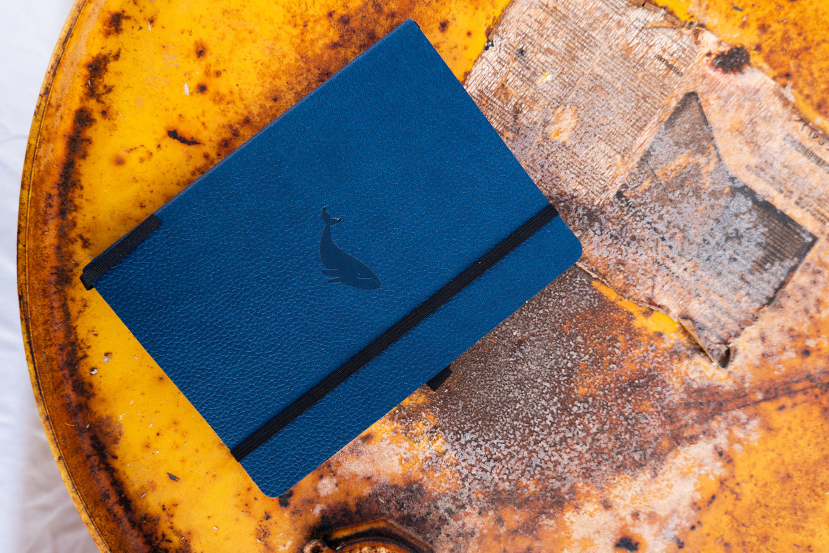
Dingbats* Pro Collection
The Pro Collection is particularly suited to brush lettering and creative experimentation.
Its 160gsm mixed media paper offers a substantial surface for practicing lettering, creating headings, and experimenting with color.
The larger B5 format provides room for full-page practice, creative compositions, and decorative lettering projects.
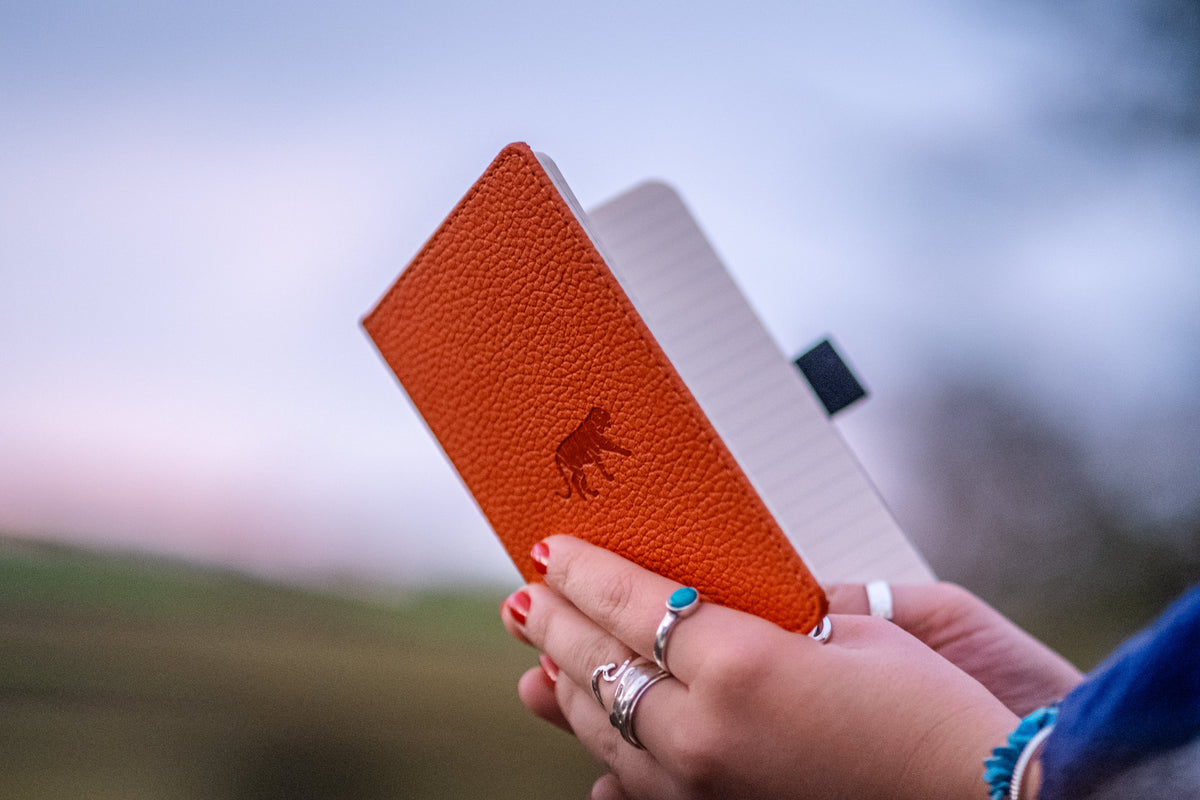
Dingbats* Wildlife Collection
Its 100gsm cream paper is suitable for writing and many everyday pens, though you should test heavier or wetter inks before creating detailed lettering projects.
It's a good fit for journal titles, quotes, and small creative details.
Dingbats* Earth Collection
The Earth Collection is ideal for people who enjoy using lettering in bullet journal-style layouts.
Its dotted pages can help with spacing and alignment, while its numbered pages and built-in planning features support organized journaling.
Try lettering monthly headings, tracker titles, or goal pages.

Brush Pen Lettering vs Faux Calligraphy
If you don't have a flexible brush pen, you can still explore the appearance of brush lettering using a regular pen. This technique is called faux calligraphy.
Write a word using ordinary handwriting or cursive lettering. Then identify the strokes that move downward.
Draw a second line beside those downward strokes and fill the spaces between them.
The result imitates the thick-and-thin appearance of brush lettering without requiring pressure-sensitive pens.
Faux calligraphy is useful for beginners because it lets you explore letter shapes and spacing independently of brush pen pressure control. It's also a simple way to practice creative headings using a fine liner.
Frequently Asked Questions
Is brush lettering easy for beginners?
Brush lettering is accessible to beginners, although controlling thick and thin strokes takes practice. Starting with basic strokes and simple lowercase letters makes the learning process more manageable.
Do you need good handwriting for brush lettering?
No. Brush lettering is a learned technique that focuses on letter shapes, movement, and pressure control. Your everyday handwriting does not determine how well you can develop your lettering skills.
What is the difference between brush lettering and calligraphy?
Brush lettering typically uses flexible brush-tip pens to create decorative letters. Traditional calligraphy often uses other specialized writing tools and established scripts, although the techniques can overlap.
What paper is best for brush pens?
Smooth paper that works well with your particular brush pen is generally a good choice. For creative lettering and mixed media experimentation, heavier paper can offer additional flexibility, although thickness alone doesn't guarantee compatibility.
Can I use brush pens in a regular notebook?
Yes, depending on the ink and paper. Test your brush pen on a spare page first, particularly if it uses a wet or heavily pigmented ink.
How long does it take to learn brush lettering?
The time varies depending on your practice and the style you want to learn. Basic strokes can be introduced quickly, while consistent letterforms and more advanced compositions require further practice.
Which Dingbats* notebook is best for brush lettering?
The Dingbats* Pro Collection is particularly suitable for creative lettering thanks to its 160gsm mixed media paper and spacious B5 format. The Wildlife Collection and the Earth Collection can also work for simpler lettering and decorative journal headings.

Leave a comment
All comments are moderated before being published.
This site is protected by hCaptcha and the hCaptcha Privacy Policy and Terms of Service apply.